Custom Booking Forms
Events Manager Pro adds a high degree of flexibility to your booking forms by allowing you to add various types of fields and gather specific information from your attendees. You can edit your forms from within the Events > Forms Editor in your admin area.
The Form Editor
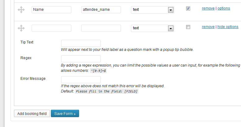
Each form editor contains a set of fields which you can add/remove/edit. You can also drag these fields in order to change the ordering. Each row in the editor represents a single field and can have the following columns:
- Label - This is what your users will see next to the input fields
- Field ID - Automatically generated, useful if using placeholders like #_BOOKINGFORMCUSTOM{field_id}
- Type - Determines what type of field this is, for further information on types, see further down.
- Required - Is this field required?
- 'Options' Link - The options link expands the row to show advanced options for your chosen field type.
- 'Remove' Link - Remove the field from the form.
To add another field to the form, click the Add booking field button. This will add a new, blank field row to the bottom the form. How you fill it in and the settings you apply to it depends on the kind of information you want to collect. You can also delete a field by clicking the remove link, or change the order of form fields by dragging the icon with four arrows on the left of each panel.
Creating a new field : Example
Let's suppose you want ask for a phone number. Under Label, type in the name you want the text field to have when it appears on your website - "Phone Number", for example.
Next, click in the Field ID box. You'll notice Events Manager automatically creates an ID for you based on the Label you added. So the Label "Phone Number" will be given a Field ID of phone_number. Unless you have a particular reason to change the generated Field ID, it's best to leave it as it is.
Next, from the Type dropdown select Text. Three extra options will appear under the dropdown.
All three fields are optional but here's how you can use them to enhance your form.
Tip Text - Add something like "Please leave your full number with area code".
Regex - To limit users to using only numbers you could use the regular expression: ^[0-9]+$
Error Message - Give a meaningful error message if the regex above doesn't match, such as 'Please use numbers only'.
The Forms
Booking Form
This is the form shown to users below where ticket quantities are selected. The information collected from this form will be stored on a per-booking basis and will be requested on every booking.
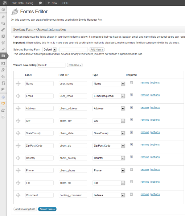
The above image is an example default custom booking form. When you first activate Events Manager Pro, custom booking forms will be enabled and the default name/email/address/comments structure will be used. You can start editing immediately, or if you just want to leave things the way they are, that's fine too.
The only required field here is the user email, which is a default registration field used to create a user account and email the user information about their booking. This field will not appear on your booking form when users are logged in, since we already know the user email from their account.
User Fields
You can define custom user fields which are stored along with other user account information when users make a booking for the first time on your site.
Once created here, they are available as new field types in your booking form editor. All user fields you add here will be available when viewing and editing user profiles within your WP admin area. You can see this by clicking on Users > Your Profile.
User fields are created the same way as creating a booking form field, you assign it a label, decide on the type of field (e.g. text, checkbox, etc.), and add any extra options relevant to that field type.
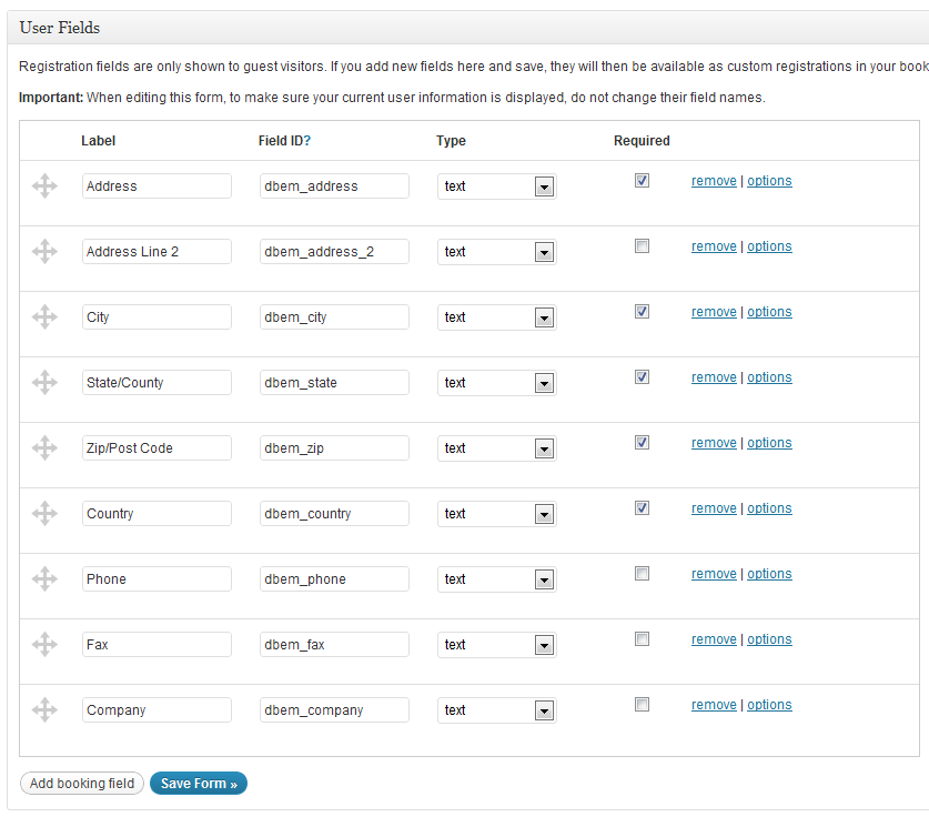
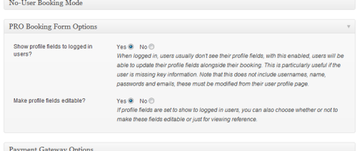
If a user is logged in, these fields disappear on your booking forms, however, you can choose whether to display the values and/or make them editable by visiting your Settings > Booking Options tab :
Attendee Form
This form is used to collect information for every space a user books. If your guests want to book two spaces, then two forms will be shown requesting information about each attendee. If the user chose two spaces for two different ticket types, then four forms are shown in total.
Attendee forms do not collect any user account information, these fields are requested on a per-booking basis and this information is stored as part of the booking.
See our guide for adding an attendee form.
Common User Fields for Gateways
Since many payment gateways require personal information from users (e.g. for address verification), Events Manager provides a way to associate your custom User fields with a set of commonly used fields. Using this method, all gateways that accept extra user information can access this information regardless of what you actually call your user fields.
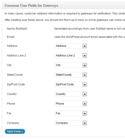
You will find your common user fields at the bottom of the Form Editor page, below your booking form and user fields editors.
By default, Events Manager Pro should automatically create these common user fields and associate them. In many cases you could leave these as is.
One thing to bear in mind is that if your gateway does require these address fields, you may want to consider adding them to your booking form to ensure that new users enter this information.
Customizable Field Types
Below is a list of all available custom field types and their subsequent options.
Here's the reformatted markdown:
html
Enter HTML into this field type to add custom information to your forms. Click the arrow to view options for each type.
Content- The html to be displayed
checkbox
Shows a single checkbox item, which results as Yes/No whether filled or not.
Checked by default?- Force the box to be checked by default.Error Message- Shown if this field is required and not checked (e.g. you must agree to our terms and conditions).Tip Text -This text will appear as a tool tip when users hover over the label of a field.
text
Simple text input, used for things like names, phone numbers, etc.
Regex- This accepts regular expressions, e.g.^[A-Z]+$would only accept capital letters. See Regular Expressions Quick Start for more info on regular expressions.Error Message- This error is shown when the above regex fails.Tip Text -This text will appear as a tool tip when users hover over the label of a field.
textbox
A multiple lined textbox, suitable for longer texts such as comments or a list of names.
Regex- This accepts regular expressions, e.g.^[A-Z]+$would only accept capital letters. See Regular Expressions Quick Start for more info on regular expressions.Error Message- This error is shown when the above regex fails.Tip Text -This text will appear as a tool tip when users hover over the label of a field.
checkboxes
Multiple checkboxes where you can select more than one option, e.g. interests.
Options- A list of available options, one per line.Error Message- Shown if this field is required and not checked (e.g. you must agree to our terms and conditions).Tip Text -This text will appear as a tool tip when users hover over the label of a field.
radio
Multiple options, but only one can be chosen.
Options- A list of available options, one per line.Error Message- Shown if this field is required and not checked (e.g. you must agree to our terms and conditions).Tip Text -This text will appear as a tool tip when users hover over the label of a field.
select
A single drop down menu can be shown with a list of given values. Users can choose one of these options.
Options- A list of available options, one per line.Use Default?- If checked, the first value in the options list above will be pre-selected. Supercedes default text.Default Text- If you want to have a default value that can't be used as a value (e.g. "please choose from this list") you can enter this here.Error Message- Shown if this field is required and a value is not selected.Tip Text -This text will appear as a tool tip when users hover over the label of a field.
multiselect
Much like a select box, but larger and allows users to select more than one field by keeping the Ctrl key (or command key in macs) pressed whilst choosing.
Options- A list of available options, one per line.Use Default?- If checked, the first value in the options list above will be pre-selected. Supercedes default text.Default Text- If you want to have a default value that can't be used as a value (e.g. "please choose from this list") you can enter this here.Error Message- Shown if this field is required and a value is not selected.Tip Text -This text will appear as a tool tip when users hover over the label of a field.
captcha
This field helps prevents spammers from successfully filling your form. This uses Google's reCaptcha service, which is free to sign up for and requires API keys from when you register your domain on their website. This field is always required.
Private/Public Keys- The keys provide to you by Google.Error Message- Shown when the CAPTCHA is incorrectly entered.
country
This is essentially a pre-populated select field with the list of countries.
Error Message- Shown if this field is required and a value is not selected.Tip Text -This text will appear as a tool tip when users hover over the label of a field.
signature
Captures a legally-meaningful signature for waivers, consent forms, medical/photo releases, or terms and conditions, backed by a full audit trail (exact wording signed, signer identity, timestamp, IP address, and tamper detection). See the dedicated Signature Fields guide for its full set of options and how signing works on the front end.
Registration Fields
Registration fields are fields already available to WordPress user accounts. These field types are only available to your booking forms.
All registration fields are considered to be text fields and correspond directly with the native WordPress user profile values. For this reason we will only explain some specific registration fields available to you:
Email This is the only required field in the form. This is because we need to have an email to send event information to and create an account with so users can access their booking information.
Name vs First/Last Name You can only use one or the other, as using Name with the other two may cause unpredictable behaviour. The name field is the equivalent of using the first and last name fields, and the name is split into first/last by the first space. This means that "John James Smith" would have first name "John" and last name "James Smith".
Username Login By default if this field is not used a username is created for new registrants automatically based on their email address. You can allow users to select their own username with this field.
Custom Registration Fields
These field types are the user fields you created using the User Fields Form Editor, described further up. These field types are only available to your booking forms.
Accessing/Viewing Booking Information
Once a booking has been made, these field values are stored along with the other booking information and can be accessed by viewing a single booking.
To view a single booking, visit the bookings dashboard or a single event booking management page and click the 'view/edit' link next to the relevant booking.
You will see the booking information within the Booking Details window. Note that registration information isn't shown here as it is available on the user information fields.
Displaying your custom forms
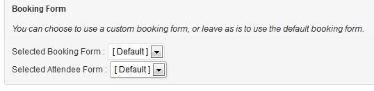
If you create more than one form, the default form will be used unless you specifically tell an event to use a different booking or attendee form.
After your form is created, you'll be able to include it with any event by selecting it from the dropdown select under Booking Form in the Bookings/Registration panel that appears on every event page in WordPress admin.